Barlow Tyrie

As part of their 100 year anniversary, bonnyday ltd reinvigorated the established Barlow Tyrie brand. We provided a modern new brand toolkit, along with a new website, printed brochures and a full restructure of the brand messaging and positioning.

100 years of Quality & Excellence.

Barlow Tyrie has been providing superb quality products for 100 years, and to bring the brand in line with this milestone, we created a 100 year crest that encapsulated a refreshed logo for use during the celebrations of 2020. During a full brand workshop, and detailed analysis of the industry today, we helped craft a new strategy, combined with creative ideas. The more modern and emotive brand allows greater audience reach, yet retains a unique character within the industry based on its heritage and core values.

Industry

Retail

What I did

Discovery & Strategy, Branding, Positioning, UX/UI, Digital Experience

Bespoke Crafted Font.

A unique crafted font, based on the original Barlow Tyrie logo, was created by bonnyday to instantly brand communications and help communicate new emotive and expressive messaging in a unique way to the brand. This is balanced with the use of a clean modern typeface, and various typeface structures for the various products.

Brand love.

As part of the new positioning, three key messages were generated to help easily narrate the Barlow Tyrie company story, on all communications, as well as define their core values and offering – helping the consumer trust, and love the brand. Brand love was created using emotive quotes, poems and story telling to help the viewer experience using the product, based on various enjoyable activities. Some examples were the joy of being in nature, peaceful relaxation and comfort, or entertaining friends at a garden party – alongside a new image toolkit based on including more people within the photography.

Inspiration from nature.

The beautiful Bee Orchid was previously used as a mascot for the brand in the earlier days, due to it consistently flowering at their main warehouse in Braintree. A toolkit of sub colours were created to work alongside the familiar dark green, which are used for product sections, and more playful communications. The distinct Bee Orchid plant was also used to craft a subtle floral pattern, alongside the sub colours, as an extra branding device across branded materials.

More than a commerce site.

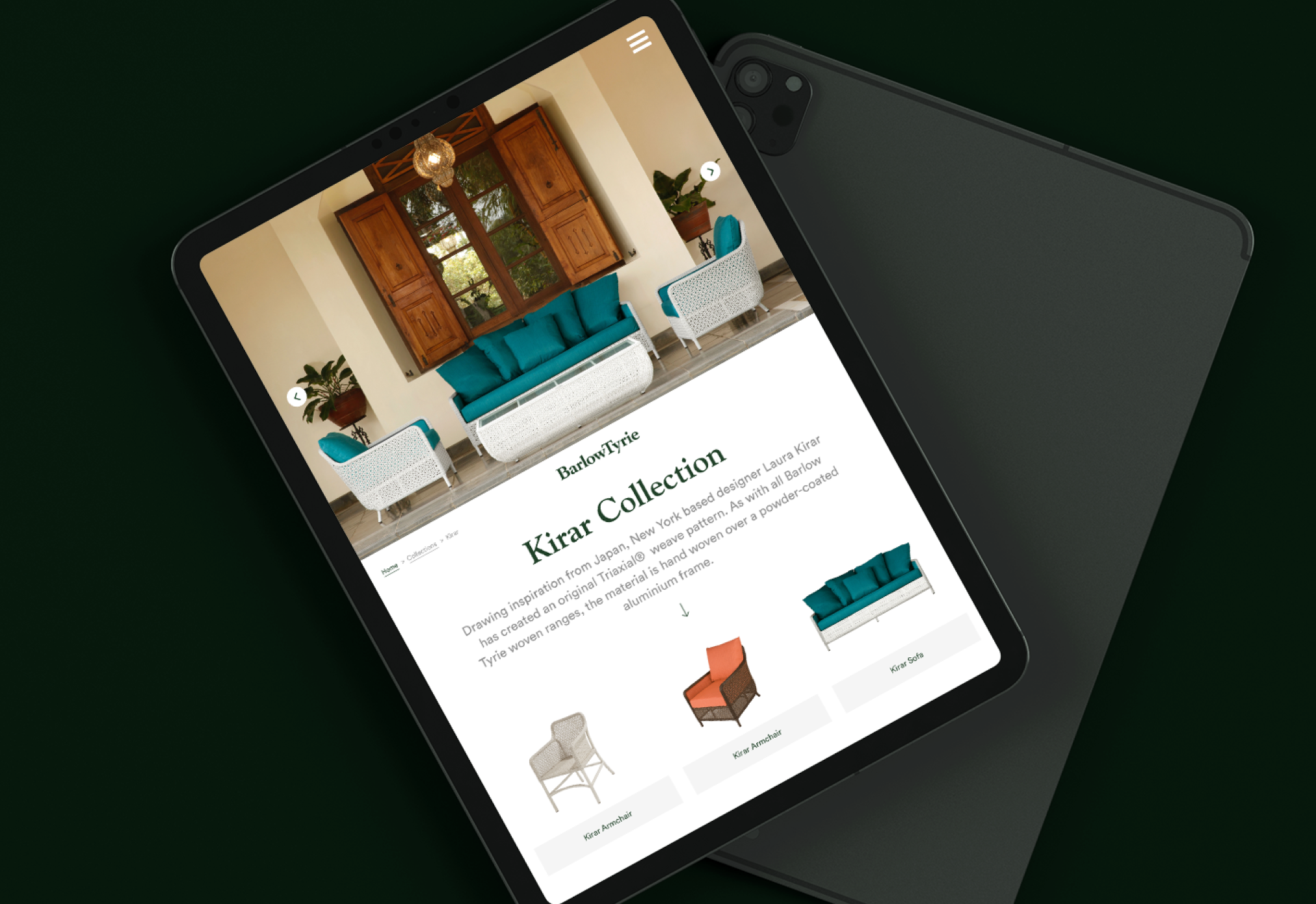
The Barlow Tyrie website now fully functions as the main resource for all available products options, and representation of the brand. The extremely complex was made simple through extensive research, analytic analysis, wire framing and template testing to create a site that feels like a brochure, but is intuitive in giving the viewer all the details required and functionality to order.

Luxury product browsing.

The main objective was giving the site an emotive brochure feel through clean photography and white space, whilst allowing all extra details to be available easily. This worked in having imagery at the top for easy browsing the products, and clean information below on interest.

Intuitive product specifications.

The website is the main point of reference for all products and specifications, so it was important to develop an extremely intuitive interface for all the product options, yet keep the clean and confident look of the brand. Further development from a UX perspective came when products became customisable on screen and then making sure these details followed through the shopping cart interface.

Look Book.

A Look Book was created to give the brand a more premium feel, and allow for a more emotive rhythm, and experience when looking at the excellent product photography. This also included a more branded introduction to the company, emotive phrases and narrative, and the use of more tactile paper stocks, and white space to give a more confident feel.

Tech spec book.

The technical specification was made more minimal to allow for easy understanding of the collections, products and details when in use alongside the more expressive Look Book. A fold out swatch on the back cover also allows for the viewer to easily compare fabric options alongside the furniture.

Next project

One Horton Heath

A vibrant new housing development. The brand and assets were evolved to deliver in two stages - investment and marketing.